
The good news is that there are some planting design guidelines to help us along. Three things to consider when arranging your plants are form, texture and color. These should be considered in the same order...form first, texture, then finally color. Form is the most consistent, while color is the most fleeting.


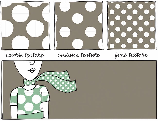
Course texture is a larger leaf, while fine texture is a smaller one. It is the combination of different textures that makes a planting design have contrast and, thus more punch. If you have too much of one texture, your overall composition will be dull. I often see too much fine texture (like the combination of ornamental grasses and daylilies). Think about how you can mix in more course (large) leaves in with your fine (small) leaves.
This same concept is true in other areas of design too, such as architecture, interior design and even textile design. I often mix pattern textures in fabric. It can be as simple as mixing a large-scale pattern with a small one. Yes, you can pair patterns in your wardrobe as long as you mix fine (small scale) with course (large scale)...just as you would with plants.

Next time you're at a nursery choosing plants, bring the containers together and make sure they complement each other with different textures. If you're missing a course texture, keeping looking for the right plant. Even after you've planted them in your garden don't be afraid to continually tweak your design each season. I am constantly moving plants around and adding new ones to get the right texture combinations.
Texture is an amazing way to add contrast and spark to your garden. I encourage you to start looking at the size of leaves and pairing them in different ways. Experiment and see what happens.


2 comments:
This is very helpful info! I read your later post about the texture in the Iowa garden and got a vague sense if what you meant but now I really understand and can try recreating it. Thanks so much!
Amy - I'm so glad this post helped!
Post a Comment