

8.04.2013

8.03.2013
THE YELLOW MEAL
Today's word as part of The August Break is YELLOW. I originally thought of sharing some of my favorite yellow plants, but I just couldn't get this one special memory out of my head. When my daughter was four or five she loved mixing her macaroni and cheese with her corn, then proudly called it the yellow meal. Oddly, a local restaurant now has a side dish with these two ingredients. Maybe she was onto something.

8.02.2013
ALLIUMS COME FULL CIRCLE
Today's word for our August Break is CIRCLE...and the first thing that popped into my mind was allium. Alliums are amazing plants that have spectacular globe flowers. If you follow my theme garden process and the circle pops up as one of your shapes, don't forget about the allium.

Two of my favorite alliums include:
Allium 'summer beauty'
Allium senescens ssp. glaucum
Both of these are in my garden (click on the names above to learn more). There are many, many types of alliums and I encourage you to explore them. They are a fabulous, eye-popping addition to a garden.
 If you'd like to read more articles like this one, please sign up for my email updates here.
Two of my favorite alliums include:
Allium 'summer beauty'
Allium senescens ssp. glaucum
Both of these are in my garden (click on the names above to learn more). There are many, many types of alliums and I encourage you to explore them. They are a fabulous, eye-popping addition to a garden.
8.01.2013
BREAKFAST & AN AUGUST BREAK
As the summer winds down and I rush to get my last few projects complete I thought it would be fun to follow Susannah Conway's August Break exercise - at least for the beginning of August. She'll list one word a day and encourage everyone to post a photograph inspired by it. Most of my posts will be illustrations (for obvious reasons), though I might pop a photograph in here and there. To add an extra challenge I'll make sure every word ties back to either food or gardening. Some will be easy (like today), but I might have to stretch a few.
To start off, like on any good day, here is BREAKFAST. This is one of my favorite breakfast meals, shared by a lovely British friend. This is simply eggs on toast, then I added one of my favorite drinks...a strawberry smoothie (with fruit fresh from the garden).

If you'd like to read more articles like this one, please sign up for my email updates here.
To start off, like on any good day, here is BREAKFAST. This is one of my favorite breakfast meals, shared by a lovely British friend. This is simply eggs on toast, then I added one of my favorite drinks...a strawberry smoothie (with fruit fresh from the garden).
If you'd like to read more articles like this one, please sign up for my email updates here.
7.25.2013
SWINGING OUTSIDE MY BOUNDS
A few months ago I heard about Lilla Rogers Studio - an illustration agency that represents artists internationally. Lilla helps match up artists' amazing work with companies that need it for products (fabrics, paper goods, totes, toys and anything else you can imagine). I initially bookmarked her website because I was enamored with her site graphics (you must really take a look...so much fun).
Since then I've learned so much about the artists she represents and the wonderful things they create. I even took a step outside my bounds and entered her Global Talent Search. Our first assignment was to create a journal cover with a playground theme. I thought you might enjoy seeing it...and I couldn't resist placing a garden twist on it too (shouldn't gardens be a playground?).
A QUICK UPDATE 8/1/13: I learned that over 1,500 artists from over 30 countries entered this contest and they had to whittle it down to only 50! Mine was not one of them, but the final illustrations are amazing if you'd like to take a peek at Lilla Roger's site. This was such a fun experience that I hope to participate again in the future.
7.23.2013
MAKE YOUR GARDEN POP WITH TEXTURE
Planting design is a science and an art. The science takes into consideration what your plants need to thrive, while the art is about composition. The latter is challenging for most and often hinders many to experiment in the garden initially.
The good news is that there are some planting design guidelines to help us along. Three things to consider when arranging your plants are form, texture and color. These should be considered in the same order...form first, texture, then finally color. Form is the most consistent, while color is the most fleeting.
 I'd like to jump right into texture, since this seems to be the most confusing, yet can be so powerful. Texture in plants is typically the size of the leaf. The collection of a plant's leaves or even the size of the stems can also weigh into texture, but for simplicity's sake, let's just focus on the leaves.

Course texture is a larger leaf, while fine texture is a smaller one. It is the combination of different textures that makes a planting design have contrast and, thus more punch. If you have too much of one texture, your overall composition will be dull. I often see too much fine texture (like the combination of ornamental grasses and daylilies). Think about how you can mix in more course (large) leaves in with your fine (small) leaves.
This same concept is true in other areas of design too, such as architecture, interior design and even textile design. I often mix pattern textures in fabric. It can be as simple as mixing a large-scale pattern with a small one. Yes, you can pair patterns in your wardrobe as long as you mix fine (small scale) with course (large scale)...just as you would with plants.
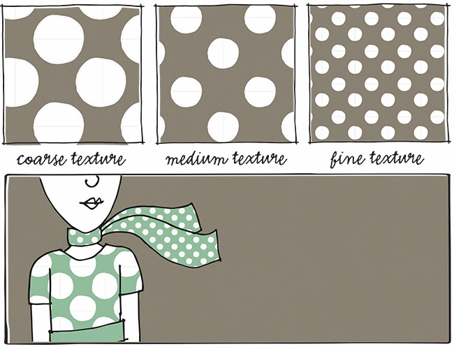
Illustrations are nice, but real plant combinations can show the true power of mixing textures correctly. Take a look at how the different scale of leaves complement each other below. Each plant pops more because of it's partner. The amazing thing is that we often focus on color when planning our gardens, but if you have a great combination of textures, color plays a secondary role. Your garden will always look good whether it's blooming or not. Note how there are few colors in the images below, yet there is strong contrast.

Next time you're at a nursery choosing plants, bring the containers together and make sure they complement each other with different textures. If you're missing a course texture, keeping looking for the right plant. Even after you've planted them in your garden don't be afraid to continually tweak your design each season. I am constantly moving plants around and adding new ones to get the right texture combinations.
Texture is an amazing way to add contrast and spark to your garden. I encourage you to start looking at the size of leaves and pairing them in different ways. Experiment and see what happens.
If you'd like to read more articles like this one, please sign up for my email updates here.
The good news is that there are some planting design guidelines to help us along. Three things to consider when arranging your plants are form, texture and color. These should be considered in the same order...form first, texture, then finally color. Form is the most consistent, while color is the most fleeting.
Course texture is a larger leaf, while fine texture is a smaller one. It is the combination of different textures that makes a planting design have contrast and, thus more punch. If you have too much of one texture, your overall composition will be dull. I often see too much fine texture (like the combination of ornamental grasses and daylilies). Think about how you can mix in more course (large) leaves in with your fine (small) leaves.
This same concept is true in other areas of design too, such as architecture, interior design and even textile design. I often mix pattern textures in fabric. It can be as simple as mixing a large-scale pattern with a small one. Yes, you can pair patterns in your wardrobe as long as you mix fine (small scale) with course (large scale)...just as you would with plants.
Next time you're at a nursery choosing plants, bring the containers together and make sure they complement each other with different textures. If you're missing a course texture, keeping looking for the right plant. Even after you've planted them in your garden don't be afraid to continually tweak your design each season. I am constantly moving plants around and adding new ones to get the right texture combinations.
Texture is an amazing way to add contrast and spark to your garden. I encourage you to start looking at the size of leaves and pairing them in different ways. Experiment and see what happens.
7.19.2013
ANOTHER SET OF VEGETABLES
My last bit of diving into the past...my tagged vegetables (back in 2012). I love the idea of scrapbooking, but never have the time to do it, so this is my attempt to add those cute little doo-dads on something.

These illustrations are also available on cards in my Etsy Shop. You can take a peek here.
Thanks for reminiscing with me!
These illustrations are also available on cards in my Etsy Shop. You can take a peek here.
Thanks for reminiscing with me!
7.17.2013
A SET OF BERRIES
In early 2012 I created this set of berry illustrations. I must have been dreaming of sweetness in the midst of winter.
 I've included these on a set of cards in my Etsy Shop too. You can take a peek here.
7.15.2013
A SET OF HERBS
Here are some more illustrations from the past...a set of herbs that I eventually made into a poster. These are just a few from that collection back in 2011.

7.13.2013
A SET OF VEGETABLES
I'll be away for a bit so decided to share some past artwork with you over the next few posts. Since we're in the bounty of summer these will focus on on vegetables, herbs and berries.
Below are a set of paintings I created on playing cards and vintage thesis paper back in 2011.

For those living in central Iowa, please visit me at the Garden Art Fair tomorrow (Sunday, July 14). I'd love to see you! You can visit my Facebook page to grab a 1/2 off coupon too.
I also wanted to let you know that I've posted my free theme garden tutorial. You can find out more about it here. Enjoy your weekend!
Below are a set of paintings I created on playing cards and vintage thesis paper back in 2011.
For those living in central Iowa, please visit me at the Garden Art Fair tomorrow (Sunday, July 14). I'd love to see you! You can visit my Facebook page to grab a 1/2 off coupon too.
I also wanted to let you know that I've posted my free theme garden tutorial. You can find out more about it here. Enjoy your weekend!


